In the process of designing my poster, I use two software which is Adobe Photoshop and Adobe Illustrator. I use Adobe Photoshop to edit poster that have stock photos and I use Adobe Illustrator for a vector poster. All of the poster I set to A3 size with the dpi of 300 to reach the highest quality.
For the first 2D poster design I use Adobe Illustrator. I have use the combination of stock vector and my own design of typography with color palette that from my research. Initially, when I was starting this design, I design the background first with a silhouette of a scary pumpkin. Then I design the border of the background by putting the vector of webs, spider, bats, pumpkin and house. This is color palette while designing this:
The second design, I was trying to be more typography with the text. First of all, I use both Adobe Photoshop and Adobe Illustrator to make this design. Initially, I use Adobe Photoshop to design the background. I fill the color of the canvas with purple and use a certain rough brush and brush around the border to make it look as a border. Then, I save the background and open it Adobe Illustrator to start designing the illustration and typography. Instead of being a boring text, I decided to mimic the scary pumpkin into a typography and the second poster is the results that I came up with. This is the color palette that I used in this design:
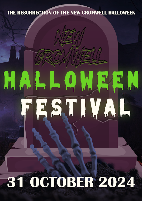
Third design, from my own opinion could be better, however I was numb about the design. I was thinking of depicting a skeleton coming out of the graveyard and I honestly was not doing great with the design. On this design too, I was using both Adobe Photoshop only. I headed to Adobe Photoshop first and chosen an appropriate background, I added the picture of the skeleton coming out from the underground and the vector of the gravestone. Then, I match the color of background and foreground. Also, in this design, I was trying to make like a engraved text on the gravestone. This is the color palette:
On the final design, I was trying to emphasize the attention to the moon. This design I use both Adobe Photoshop and Adobe Illustrator. First, I use Adobe Illustrator to set the color of the background and I illustrate the moon by myself. After doing that, I import the file into .PSD file to edit it in Adobe Photoshop. With the moon that I made, I design it by downloading a horror tree brushes and grass brushes and I brushed it in the moon. I also add a silhouette of a flying with trying to depict that witch is flying in front of the moon. This is the color palette that I used for the design:


Good that you have explored some different ideas - please add some commentary and discuss your typography and layout in more detail
ReplyDelete