Today we learn about how to make an advertisement. There are many aspects we need to looked at as we making an advert. There are imaged that we used, Typography, Layout, Logo/Branding, tagline and meaning of the adverts as a class.
For our class practice, our tutor set the theme as a fashion. Fashion is very diverse attire as everyone has their own fashion. Generally, men and females are the contrast of how their fashion are. Men tends to wear coat or very subtle color. Meanwhile, mostly women tend to wear something that are color appealing. For this practice, I will use pictures of men fashion.
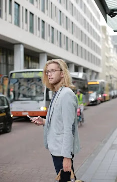
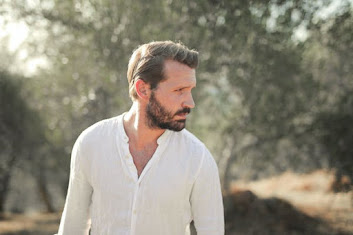
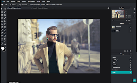
To search for photos, I use a free no copyright website called pexels.com. I search pexels.com in the Google search engine and click the correct link. After clicked it, there was a box you can search for the photos. I search "Men Fashion". After scroll thoroughly, there is one photographer that has taken interest in me. It was Andrea Piacquadio. I chose 3 picture from Andrea Piacquadio. Here are all the photos:

I love the simplicity of the man in the picture wearing a simple grey coat. From the background of the picture, it shown that he is waiting for transportation perhaps to his workplace. His attire was simple nothing particular on his clothes.

Again, in this photo showing a father vibes wearing just a simple white T-shirt. I feels like simple is richness. Even though his wearing seem simple, but based on where he is and how he is taking care of his appearances convey that you don' need to exaggerate your rich and luxury clothes to show that you are rich.

I love the attire here with the sophisticated spec, a neat smart hair, black turtleneck with a brown coat. Overall of his wearing showing the richness of a person but with a lowkey unappealing color. Most of men fashion, color does not appealing in contrast to women. From that picture, I believe that we don't need to over doing our fashion to look smart and neat. A simple coat and turtleneck should do it!
After decided which picture to use in my advert, I straight go to Pixlr. I use Pixlr E and click create new. As usual, A box will pop up. For this project, I use A3 by going to print and click on A3. I gave the title as "Distinguish Gentleman" and set the background to color white. The orientation of the canvas is portrait. I want to use landscape for this advert. To turn the canvas landscape, I click on Image, Canvas rotation and rotate left/ccw. The canvas should be landscape

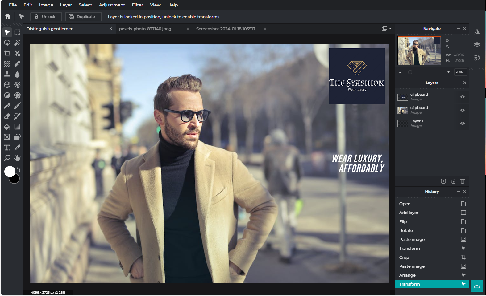
Next step is to put the image that I chose into the canvas. To do that, The first step is to click on File, Open Image, and a windows box with appear. I go to windows because it is the location of photo I download. I click on my chosen picture and click open. After that, you will be in a separate canvas. You need to click on Select, Select All, and Copy. Go back to the canvas and click on Edit and Paste. Your photo should be on the canvas. There was also a white background as the photo did not fully fit in the canvas. To get rid of that, I use Crop Tool I scale it down fit with the picture with no white background. Now I have 2 layer for background and the photo itself.

For this practice, we going to use a websites called freelogodesign.org to generate the logo of the advert. I search the link in the Google search engine and it should move to the websites. As in the websites, there is a box to put your company name. For this practice, I put my name and a combination of the word "Fashion". It resemble as "The Syashion". Then, the websites will generate your logo automatically. I clicked on fashion category so my logo will be related to fashion. After scrolling a bit, I found a simple and luxury looking logo. I chose that one and customize the text. For the tagline, I put it as "Wear Luxury". This logo is purposely main focus on a Millennials gentlemen who like to wear luxury fashion.

Then, after completed the logo. I want to add the logo into the canvas on Pixlr. The way of making that is, I went to File, Open Image, and windows box will pop up. I then go to the location I downloaded the logo then open it. Next, click on Select, Select All, to Edit and Copy. Go back to the canvas at the top menu, click on Edit and Paste. My logo was in the middle of the canvas. To move it, I use Arrange or Move Tool to move it at top right corner. I also resize it to appropriate size.

After placing the logo, I am thinking of putting a tagline in my advert. I click on Text Tool and click on the canvas. A box will pop up asking to add a new layer and click add. After that, I double click at the text and type to "WEAR LUXURY, AFFORDABLY". I change the size to 120 and use the Bebasneue font as to me it evoke the feelings of simplicity. Then I move it using Arrange or Move Tool to the right of the middle right of the canvas where there is now object that covering the tagline.

In this practice, I have learnt that making an advertisement is not an easy job. You need to think about every aspects of what are you doing on the canvas the function of what are you putting onto the canvas. This is because advertisement is suppose to be telling the people the meaning of the advertisement either it directly or subtle indirectly. I learnt that there more than just advert a product. I can advert a jokes or a satire or something. For instance, satire about Gen Z teens advert. I can understand the objective of doing an advert just need more practice so I can squeeze out my creative ideas out of my brain.


Very good work with good thoughts on the design process and good technical detail - very well done
ReplyDelete