In the first of Week 9, I will be creating a gallery page for portfolio in Wix to showcase all of my projects.
First of all, on the frontpage of my Portfolio page, I want to change my background colour so it will be blend very well. To do that, I right click on the background and click on Change Background.
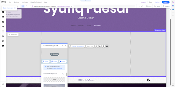
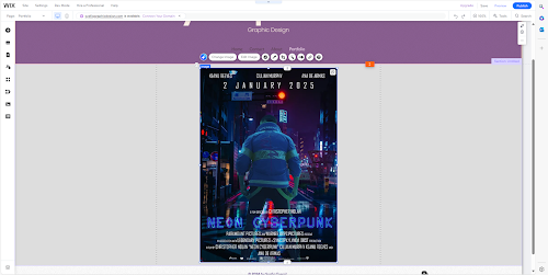
Next, I want to add an image from one of my projects. I do that by clicking Add Elements on the left bar menu, then to Image. For this case, I saved my image projects in Google Drive. So I click on Import Images and connect to my Google account. Then I choose one my image and open. Then, I add it to page. When the image is on the frontpage, I click on it to transform to appropriate size.
After that, I need a new page as the subpage of my project where I can show my projects. I click Site Pages and Menu on the left bar menu, then Add Menu Item and make a new blank page. Now I have new page and I rename it to Neon Cyberpunk as it is my projects name. After that, to make it as a subpage, on the Site Menu page, I click the Three dots button on my Neon Cyberpunk page, then I click on Subpage underneath my Portfolio page.
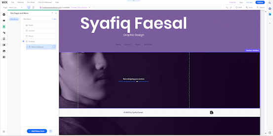
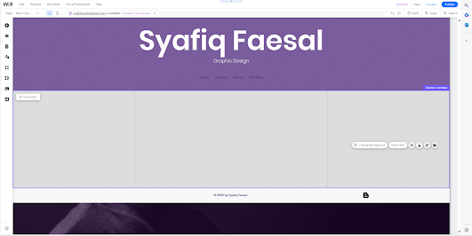
Then I change the background colour as the same as my Portfolio page. Now my portfolio subpage is ready to upload my projects.
Then I want to add a title of my projects. I go to Add Elements and slide to Text . I set the Themed Text as Heading 1 the same as my main pages. Then, I change the text to my title Neon Cyberpunk with Poppins Semi Bold font and 60px size. Then, I click on it to move it and arrange to the middle. On to the next elements, I want to add Gallery where I can showcase my projects. I do that by clicking on Add Elements on the left menu, then click on Gallery. There are bunch of gallery style options, I took my time to choose the suitable one as my projects will be portrait.
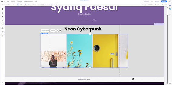
Then, the important elements is the button to go back to the portfolio page. To add a button, I go again to Add Elements and click on Button. I choose one of my Themed Button then afterwards I change the design. I click the button and arrange it underneath my projects title and arrange it in the middle. I double click to change the text to Portfolio and Links to my Portfolio page every time it clicked it go back to portfolio page. I double click the button, and click Design to design it. I set font to Poppins Extra Light with 18px size.
Then, I go back to Portfolio page and do the same. I add a button and put in underneath my projects image. I rename it to Neon Cyberpunk and Links it to Gallery. I design the button by double click and Design.
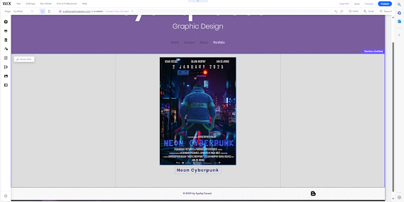
To make sure it work properly, I go to Preview mode and check if the button working. I click the button and it bring me to the correct sites. So it is working. After that, I want to select a Gallery style of how I want to show my projects here. I go to Add Elements, and go to Gallery and choose the one that I find suitable. I dragged it to the pages and double and Manage Media. I delete all the unnecessary image and replace it with projects image. Then, I rename the title to appropriate name.
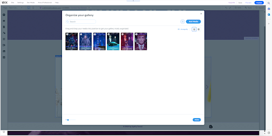
Then I click save after make that selection. I make sure to click Save every time so I do not lose any progress and changes that I have made. Now I have my gallery working.
Then, the Mobile view is crucial. I click on Mobile at top left bar menu to see how is the mobile view looking. It got problems where it does not arranged. I move to Portfolio pages, and the problem is the font of the button is too big. To change that, I double click on it, Design and go to Text. I change the text size to 20px and now it is looking good.
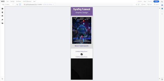
On the my projects showcase pages, the gallery is too small. I fix it by click on it and arrange it to proper size. Nothing much too fix here.


Good process with good technical detail - very good
ReplyDelete