In this post I will go through the process of me designing my digital brochure. The elements that I should be consider is the design of the frontpage, the design of the content page (background), context about the event and brochure maker.
For the frontpage, I decided to use Adobe Illustrator. This is the frontpage that designed by me:
This is the color palette:
I started by filling my artboard with darkest red (#220901) base on the color palette as a background. Then, I put the main title "New Cromwell" and use a gradient on it with the color from #bc3908 to #f6aa1c . The font that I used for that is Franklin Gothic Heavy. For the "Halloween Festival" I use Melted Monster. Then, I duplicate it to make it look 3D effect. The front one I use #f6aa1c color and behind it is #bc3908 color. The behind text, I convert it to outline by going to Type > Create Outlines. Then, I drag it all the way to the bottom to make it look melting, After that, I use one of the pumkin vector and I put it on top of it. I make sure the color of the pumpkin is the same as the background to make it seem blend. That is how I design my frontpage.
After that, I proceed with designing the background for the content. Since it is a background, I wont be designing and putting a lot of elements in it. This is my design:
First step that I did is I fill the board with a dark red color. Then I use the border design that I took from stock and put in appropriately on the board. The color was black, then I change it to lighter red to it matches with the background color.
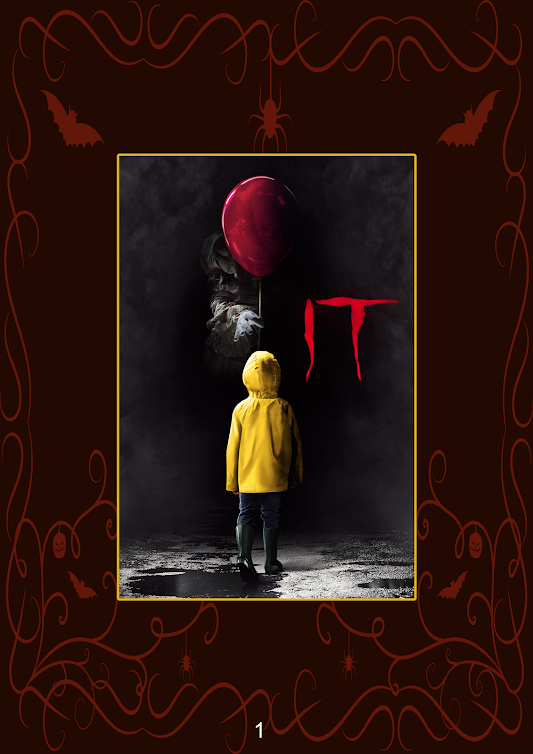
After that, I head to photoshop and finish up putting all the text and picture regarding the event. This are all the pages:
After all of this, I went to www.ilovepdf.com/jpg_to_pdf to change it to pdf file so I can make it as a brochure. I use heyzine.com to make it a brochure and it required a pdf file. On the next post, I embedded the actual brochure itself.


Comments
Post a Comment