In this post, I will presenting my brand as a prototype. I made a various type of logo based on the logo I chose, the reason of this to see which one is the most attracted to viewer eyes base on different type of shapes and typography of my logo. Then, I will publish a questionnaire to analyze and decide which one is the best for my brand. While making the 2D prototype, I am using Adobe Photoshop to edit and form a logo. This is the prototype:
Fig 1
Fig 1 is the logo that I made with different shape and different font. I kept the shape with of it being rectangle and using different font. I got the font from DaFont.com which is, Who Ask Satan, Another Danger and Melted Monster. For me, I did not prefer my brand logo to be rectangle. However, that is the reason that I will make a primary research about it.
Fig 2
Fig 2 I experimented with shape of the logo. I made it become circle. Personally, this circle logo look much more branded than the rectangle.
Fig 3
Fig 3, I use different picture for the logo. I kept the shape and experiment with different font.
Fig 4
Fig 4, I change the shape into oval. The reason I made it oval so the serpent cant be visible.
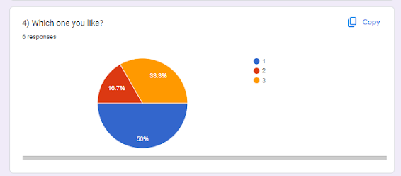
After all that, I use Google Form to how other people thought on this. This is the results:


Comments
Post a Comment